You might have noticed I've been trying out SAS ODS Graphics lately, whereas in the past I mainly used SAS/Graph for my samples. In this blog post I step you through my latest fancy SGplot graph - hopefully you'll learn some tips & techniques, as you follow along. (I don't generally recommend using fancy graphs, but it's a good way to experiment and learn the software!)
Data
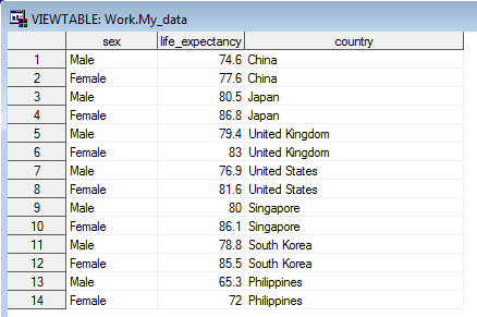
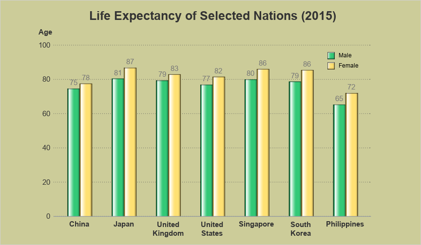
After working on the Hans Rosling animation, I decided to dive into another life expectancy graph. I'm basically reviving one of my old samples, and updating it with the latest data, and using the latest ODS Graphics software. I found the updated 2015 life expectancy data, by country, on Wikipedia, copy-n-pasted the data for the desired countries into a data step, and read it into a SAS dataset.
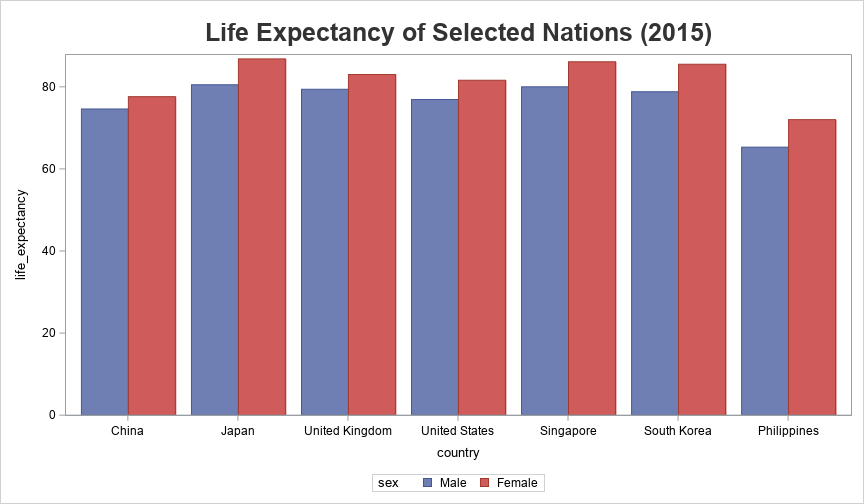
Basic Chart
And now, with the following minimal code, I can create a grouped (clustered) bar chart:
proc sgplot data=my_data;
vbarparm category=country response=life_expectancy /
group=sex groupdisplay=cluster;
run;
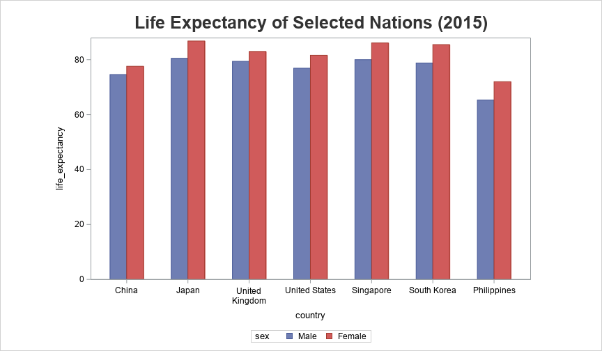
Bar Width
By default, the bars occupy all the available space ... but I prefer to have skinnier bars, and some space between them. I accomplish this using the code (in red) below.
proc sgplot data=my_data pad=(right=20pct left=15pct);
vbarparm category=country response=life_expectancy /
group=sex groupdisplay=cluster clusterwidth=.55;
run;
Bar Colors
Next, let's use more meaningful colors (pink for females, and blue for males), move the legend to a location where it will not require any additional space. Also, I want to have the yaxis scale go to 100 (since 100 years old seems like a nice/round age), and I want all the 2-word country names to be split onto two lines (not just the arbitrarily long ones). Note that I didn't have to specify the splitchar here, since a blank is the default - but I included the option in case you prefer to use a different split character.
proc sgplot data=my_data pad=(right=20pct left=15pct);
vbarparm category=country response=life_expectancy /
group=sex groupdisplay=cluster clusterwidth=.55 name='bars';
styleattrs datacolors=(dodgerblue pink);
xaxis display=(nolabel) Fitpolicy=SplitAlways Splitchar=' ' display=(noticks);
yaxis label='Age' labelposition=top values=(0 to 100 by 20)
display=(noticks noline) grid gridattrs=(color=gray55 pattern=dot)
offsetmin=0 offsetmax=0;
keylegend 'bars' / position=topright location=inside noborder
across=1 outerpad=(right=15px top=5px) fillheight=15;
run;

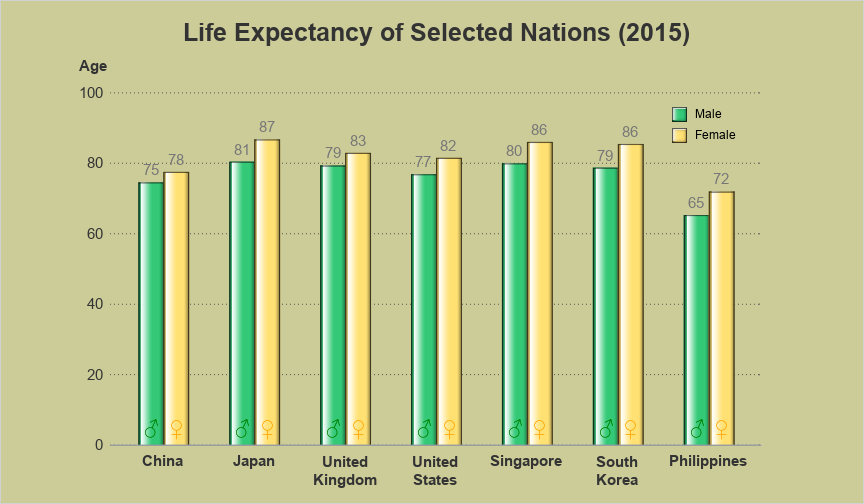
Label Bars
You can tell approximately what the life expectancies are by looking at the bars and the axes & grid lines, but what if you want to know the exact values? You could set up HTML mouse-over text to show the exact values, but the user could only view them in a web browser (not printed copies, or screen-capture images, etc). So let's show the values at the top of each bar. We can use the datalabel option for that.
vbarparm category=country response=life_expectancy /
group=sex groupdisplay=cluster clusterwidth=.55 name='bars'
datalabel datalabelattrs=(size=11pt color=gray77);
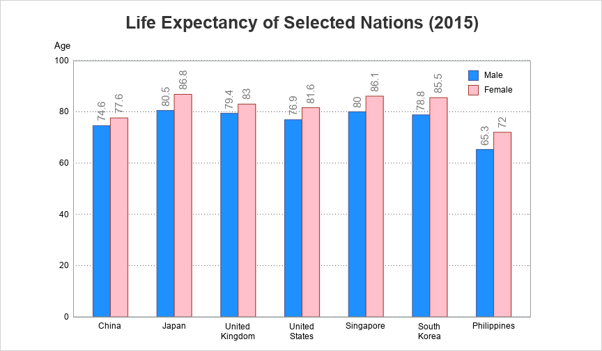
Formatting the Labels
Hmm ... those labels at the top of the bars don't look quite as good as I had hoped. Since some of the labels are too long to fit across the top of the bars, they have been automatically rotated. If they all showed a rounded value (with no decimal places), they could fit on top of the bars without rotating the text. Therefore I created a new variable, with the values rounded to 1 decimal place, and then specified that as the datalabel. Note that this works because I am using pre-summarized values for each bar, and a vbarparm chart (if I had used a vbar chart, with non-summarized data, then only the first value for each bar would have placed on top of the bar).
life_expectancy_formatted=trim(left(put(life_expectancy,comma5.0)));
datalabel=life_expectancy_formatted

Fancy Colors
Now we've got a very nice chart ... so why mess it up by making it even fancier?!? Well, creating a fancy chart is a good way to learn features. And in certain cases (depending on the audience and the purpose), a fancy chart could be desired. Perhaps you want a decorative chart, or the purpose of the chart is just to grab the reader's attention (rather than provide an analyst with a good way to visualize the data). Sounds kinda weak, eh? ... But let's give it a shot. Here's the same chart, with different colors, and dataskin=gloss - changes the whole look, eh?
styleattrs datacolors=(cx33c977 cxffe173) backcolor=cxCCCC99 wallcolor=cxCCCC99;
Annotating on Bars
They say "if a little bit is good, then a lot is better" ... I don't believe them, but let's go ahead and add one more fancy feature. Let's annotate male & female symbols on each of the bars (using the sganno= option), so the user doesn't have to look at the legend as often. There's not really a data-driven way to annotate on the specific bars in SGplot, but you can annotate in the middle of the group of bars. I then add an offset to the left and right (using a bit of trial-and-error to determine exactly how much offset), so that the symbols show up in the center of the bars.
ods escapechar='^';
data my_anno; set my_data;
layer="front"; function="text"; textsize=14; anchor='center';
x1space='datavalue'; xc1=country;
y1space='datapercent'; y1=5;
textfont="arial";
discreteoffset=-.12; textcolor="cx008000"; label="^{unicode '2642'x}"; output; /* male */
discreteoffset= .15; textcolor="cxffa500"; label="^{unicode '2640'x}"; output; /* female */
run;
One of my hobbies is DJing (playing music for) classic car shows. I have a very loud stereo, but one of the things I learned is that people enjoy the music more if you only turn up the volume "just enough" that they can hear it clearly - you don't need to blast it full-volume all the time. The same lesson can be applied to graphs - you don't need to use all the fancy features all the time. Know your audience, and know how much fancy (or not fancy) will create the graph that's most useful for them.
For this graph, where would you have stopped adding fancy features? Or what other features might you have utilized? (Feel free to discuss in the comments.) If you'd like to experiment with this example, here's a link to the complete SAS code.


4 Comments
Too fancy schmancy for me! Personally I would have stopped before it got fancy. 😉
🙂
Something that might be a nice add in (if you had more data) for these would be tool tips where you could have extra information such as the uncertainty in the life expectancy values. Additionally I think for type of information where you are comparing two categories (again with more data) a violin plot proves to be more informative because then you get an idea of what the distribution looks like.
If you click the final graph, you can see the 'interactive' version with tool tips (HTML mouse-over text), that shows the county, the sex, and the lift expectancy value for each bar. Keep an eye on future blogs for violin plots (but those are more for showing the distribution by age group) 🙂